
Hey, all you design junkies and entrepreneurial dreamers! Buckle up, because today we’re plunging headfirst into the swirling vortex where snazzy graphics meet serious business. Yup, we’re gabbing about modern logos that aren’t just turning heads, but also making cash registers sing. These aren’t your grandma’s logos—nah, these bad boys are the rock stars of branding, each one a visual anthem of what a brand is all about.
So, what’s cookin’ with these fresh logos, huh? Glad you asked! Sit tight, because we’re gonna peel back the layers and serve up some piping hot insights on why a killer logo is basically your brand’s bestie. We’re also gonna spotlight some absolutely jaw-dropping modern logos that are rewriting the rulebook on what makes a brand stick in people’s minds.
Alright, enough with the chit-chat. Let’s roll up our sleeves and dive into the thick of it, shall we?
So, Why Is a Logo So Important?
Let’s kick things off by asking ourselves, why is a logo important? Well, imagine walking into a party and blending in with the wallflowers. Not too exciting, right? That’s what it’s like for a business without a compelling logo—it gets lost in the crowd.
1. Grab Your Potential Customer’s Attention
Alright, listen up, folks! Your logo’s got one job right off the bat: grab those wandering eyeballs and glue ’em to your brand. Let’s be real; we’re all zooming through life with the attention span of a goldfish. So, your logo better make folks stop scrolling and go, “Whoa, what’s this?”
Think of your logo as the ultimate icebreaker, the wingman that sets the stage for your brand to swoop in and make a lasting impression. It’s that first catchy lyric in a song that makes you go, “Hold up, I gotta listen to this.” So, your logo’s gotta have that special sauce, that mojo that reels people in and gets ’em curious to know more. Got it? Good!
2. Make a Great First Impression
So let’s talk about first impressions, shall we? You know how crucial they are, right? Just like showing up to a first date in sweatpants is a no-go (unless that’s your thing, no judgment!), the same applies to your logo. It’s the “Hey, how you doin’?” moment between your brand and everyone who lays eyes on it.
Think about it. Your logo is like that snazzy outfit you put on for a big night out. It’s got to make people stop and think, “Whoa, who’s this?” A poorly designed logo is basically like showing up to a swanky event in pajamas—you might get noticed, but for all the wrong reasons. On the flip side, a killer logo is like strutting in with a tuxedo or a killer dress; people instantly know you mean business.
So, what’s the takeaway? Your logo needs to make a stellar first impression. It’s got to pop, sizzle, and basically do a little song and dance that screams, “This brand is the real deal!” In short, you’ve gotta make sure your logo doesn’t just enter the room; it should make a grand entrance. Give folks a reason to believe that your brand is the one they’ve been waiting for. Trust me, you don’t want to be the wallflower at the branding party.
3. It Tells a Brand Story
So, what can a little ol’ logo tell you? Oh, you’d be surprised! Picture this: You’ve got mere seconds to introduce your brand to someone who knows zilch about it. Your logo takes the stage, and boom! Whether it’s through bubbly colors, sleek lines, or snazzy fonts, your logo spills the tea about what your brand is all about.
Is your vibe more like a pumped-up rock concert or a chilled-out jazz lounge? Your logo sets the tone and tells that story quicker than you can swipe right on a dating app. It’s a storytelling genius wrapped up in a visual snack.
4. Stand Out From Competitors and Ensure Brand Loyalty
Now, let’s talk about standing out in a world where everyone’s screaming for attention. You don’t want to be just another face in the crowd, do you? Heck no! Your logo is your VIP pass, the thing that nudges people and says, “Hey, check this out, isn’t it rad?” A kick-butt logo is your first impression, your ice-breaker, and your secret handshake all rolled into one. It’s what makes people go, “Oh, these guys? They’re the real deal!”
But wait, there’s more! Once you’ve got ’em hooked, you want to keep ’em coming back for more, right? That’s where brand loyalty steps in. A logo that’s unforgettable is like that catchy tune you can’t get out of your head. People start recognizing it, trusting it, and before you know it, they’re your brand’s own groupies, advocating for you to all their buddies.
Here Are Some Significant Types of Logos
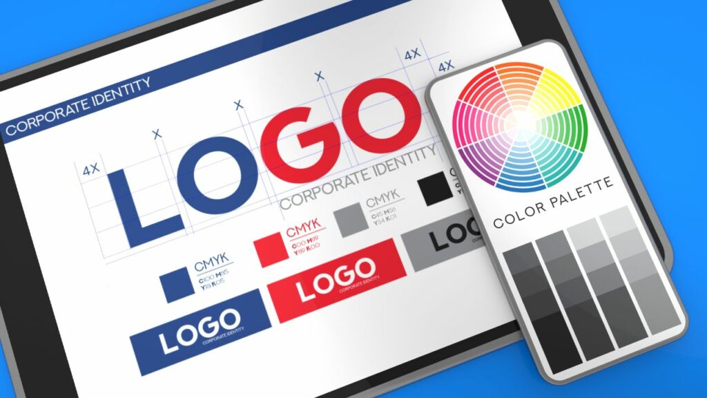
So you’re sold on the idea that a killer logo is essential. Great! But how do you go about creating one? Knowing the different types of logos is a good place to start.
1. Wordmark
Wordmark logos are like that quiet kid in class who nails every exam—they don’t show off, but man, do they pack a punch. Yup, these bad boys are made solely of text, generally the brand’s name, and let me tell ya, the font game has got to be on point.
Take Google, for example. Simple, colorful, unforgettable. Or what about Coca-Cola with its timeless script? These logos prove that you don’t need all the bells and whistles to make a big splash. Simplicity isn’t just a style; it’s their superpower. So if your brand’s all about that no-nonsense life, a Wordmark might just be your soulmate.
2. Lettermark
Switching gears, let’s get into the Lettermark zone. You know, for those of you who can’t be bothered to spell out your entire business name every darn time. Yup, I’m lookin’ at you, International Business Machines—no wonder you go by IBM! Lettermarks are basically the cool abbreviations of the logo family. HBO, NASA, CNN—they’ve turned their names into a snazzy little package of initialism goodness. These logos are the epitome of ‘less is more.’
All about compactness and immediacy, they’re perfect for businesses that have tongue-twister names or are just way too long to fit on a business card. Plus, they’re super easy to recognize. In a world cluttered with noise, a Lettermark stands out like a sore thumb—in the best way possible, of course.
3. Emblem
Let’s chat about Emblems. Think of them as the family crest for your brand—a fancy shield or badge that’s gonna make you look all noble and whatnot. You’ve seen this with classics like Starbucks and their mermaid, or Harley-Davidson with its iconic shield and text combo. These bad boys ooze tradition, sophistication, and an air of “we’ve been around the block a few times, and we know our stuff.” No wonder they’re a go-to for institutions that wanna project stability, like schools, government bodies, and you guessed it, your fave coffee shop where you spend half your paycheck.
4. Pictorial Mark and Abstract Mark
Alright, moving on to the eye-catchers—Pictorial and Abstract Marks. Pictorial marks are like the celebrity lookalikes of the logo world. You see an apple, and boom, you’re thinking of MacBooks and iPhones, not fruit salad. These logos capitalize on universally recognized images to make their point, no words needed. It’s like they say, “a picture’s worth a thousand words.”
Now, if Pictorial Marks are like celebs, then Abstract Marks are like the cool, indie musicians who don’t want to be put in a box. These are the artsy-fartsy types that use geometric shapes, lines, and abstract forms to express the essence of a brand. There’s no literal representation here, so it’s all open to interpretation. You get to flex your brain muscles a bit. Think of the squiggly Airbnb logo or Pepsi’s circle thingamajig.
Here Are Top Inspirational Modern Logos That Help Establish Brands In Their Niches
Prepare to be dazzled, because we’ve curated a list of modern logos that are not just turning heads, but also shaking up their respective niches.
1. Coppock Painting
Alright, let’s talk Coppock Painting. This logo is basically the Beyoncé of painting logos. I mean, c’mon, it doesn’t just use brush strokes; it practically dances with them. The result? A logo that screams artistry with a capital “A” while still keeping it professional. It’s like the logo itself could hang next to a Monet and still hold its own. In a sea of painting companies, this one’s the showstopper that makes you go, “Now, that’s who I want sprucing up my living room!”
2. Acetree
Now onto Acetree. If Bill Nye the Science Guy and Captain Planet had a branding baby, it would be this logo. Seriously, it’s the epitome of when nature meets science and they decide to high-five. A tree, right? Wrong. Look again, and you’ll see the branches and leaves forming a molecule. This baby isn’t just environmentally friendly; it’s got its chemistry textbook out and is ready to ace the test. How genius is that? This logo says, “Hey, we care about the planet and we’ve got the science smarts to prove it.”
3. Jamee Handee Photography
Last but not least, let’s snap into Jamee Handee Photography. This logo is like the unicorn of photography logos—unique and downright magical. Picture this: a hand cradling a camera lens. It’s as if every click comes with a personal touch, a slice of soul. It’s intimate, inviting, and says, “You’re not just a client; you’re part of the creative process.” The logo perfectly frames the ethos of this photography biz: personal, intimate, and downright unforgettable.
4. Combat Warriors
Let’s talk Combat Warriors. Man, if this logo were a person, it’d be the one kicking down doors and taking names. It’s robust and makes no bones about its masculinity. The strong, confident lines practically shout toughness, while the earthy tones say, “Hey, we’re gritty and grounded.” It’s got that raw, Spartan vibe that makes you want to pump iron or climb a mountain. No wishy-washy pastels here, my friend; this logo is all about resilience and warrior spirit.
5. Bespoke Imports Group
Let’s class it up a bit with Bespoke Imports Group. Think James Bond meets world traveler. It’s got this snazzy compass integrated right into its core, whispering “Hey, we’ve got the whole world in our hands.” The design is sleek, polished, and oh-so bespoke. You look at this logo, and you think, “Man, this brand’s got some serious globe-trotting elegance.” It’s got that cosmopolitan flair but also keeps it classy, you know?
6. Gemns
Let’s dive into the glittering world of Gemns. If this logo were a movie star, it’d be on the Hollywood Walk of Fame for sure. It’s dazzling, multifaceted, and downright attention-grabbing. It literally sparkles, reflecting all the qualities of a high-value gemstone. When your peepers catch this design, you can’t help but take a second look. It’s like that shiny object in the room that you just can’t ignore. The design captures your eye and makes you want to know more about the brand behind this glitzy logo.
7. Stonepath
Man, where do I even start with Stonepath? This logo is like that chill friend who’s easygoing but still totally has their act together. It’s got these cool earth tones and basic geometric shapes that just scream, “Hey, we’re straightforward, and we’ve got our feet firmly on the ground.” It’s like the brand is telling you, “We’re dependable, just like the earth beneath your feet.” It’s not trying to be something it’s not, and people dig authenticity, you know?
8. Terry Britten
Okay, raise your hand if you’re tired of those typical, snooze-worthy music logos. Yeah, me too. That’s what makes Terry Britten’s logo a breath of fresh air. I mean, a guitar pick shape peppered with musical notes? Come on, that’s just pure genius! It dodges clichés like Neo dodges bullets in The Matrix. The logo’s not just singing; it’s hitting those high notes flawlessly, capturing the essence of what Terry Britten brings to the musical table. It’s as if the logo itself is strumming a sweet melody.
9. Sharp Wealth
Let’s get down to business with Sharp Wealth. You see that arrow pointing upwards? That’s not just an arrow; that’s a freaking rocket ship to Financial Freedomville! It’s like the logo is whispering in your ear, “Hey, buddy, stick with us, and the only way is up!” It beams positivity and an optimistic outlook on your financial growth. In an industry that’s usually as dry as a cracker, this logo brings a splash of cool water, making you think, “These guys get it; they’re as invested in my growth as I am.”
10. Aevaru
Alright, you made it to the grand finale! Last but definitely not least, let’s talk about Aevaru. This logo is the epitome of “mystery meets genius.” Seriously, it’s like the Sherlock Holmes of tech logos. It’s all abstract shapes and swirling designs, kind of like modern art had a baby with a microprocessor. But here’s the kicker: it’s not just about looking cool or artsy. This logo is a curiosity magnet. You see it, and you instantly want to know more. What does this company do? What kind of innovative tech wizardry are they up to? It begs you to dig deeper, and that’s a win in the branding playbook.
The Aevaru logo is a perfect mirror to the company’s mission, which is all about pushing the boundaries in tech. You see that abstract shape in the logo? It could be anything—AI, cloud computing, quantum doodads, you name it. It leaves a lasting impression that this is a company that’s all about thinking outside the box. Heck, they probably crushed the box to make a hypercube or something!
Phew! There you have it, folks, our tour of modern logo greatness has officially come to an end. Let me tell you, these aren’t just snazzy doodles or flashy emblems. These logos are the real MVPs in the business game. They’re doing the heavy lifting when it comes to branding—grabbing attention, sparking curiosity, and making sure their companies aren’t just a flash in the pan. They’re like the Swiss Army knives of the corporate world: versatile, functional, and oh-so-sleek.
So, what’s the takeaway? Whether you’re a logo geek, an entrepreneur, or just someone who appreciates a good design when you see one, remember that a logo is way more than just a pretty facade. It’s the front door to a brand’s world, and man, you better believe it’s worth knocking on!
Conclusion
Wow, what a ride, huh? We’ve dug deep into the fascinating world of logos today, from wrapping our heads around why they’re the superheroes of branding to dissecting the different logo species out there. And let’s not forget those absolute stunners of modern logos we paraded—those guys are seriously setting the business stage on fire!
Now, let’s get real for a sec. A logo isn’t just some artsy doodle you slap on your business card. Nah, it’s the beating heart of your brand’s identity, my friend. You’ve gotta pour in some real elbow grease, brainstorm, and maybe even have a Eureka moment in the shower. Trust me, it’s worth every penny and pondering second. Aim to craft something that doesn’t just blend in but blasts off the page and into people’s memories.
So, are you buzzing to go out and conjure up a jaw-dropping, awe-inspiring modern logo that’ll have folks doing double-takes? Awesome sauce! Unleash your inner artist and go turn your brand into the talk of the town. Catch ya on the flip side, and remember—branding is where the magic happens!
Zach Aries is an entrepreneur committed to providing personalized service and satisfaction across America. From businesses to charities, Zach ensures every client receives top-notch treatment. His dedication to excellence shines through in his work, whether it’s crafting quality custom apparel or sharing insights in printing and T-shirt reviews.